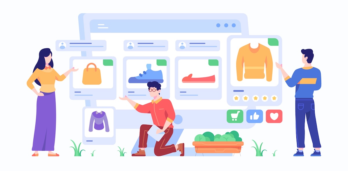
Enhancing WooCommerce Shopping Experience with Modern UX Patterns
Why are your customers leaving without buying? Why do people visit your store, scroll a little, click maybe once, and then disappear? It’s frustrating. You know your products are good. Prices are fair. Still, something feels off. It’s not always the product. Sometimes, it’s the experience.
Imagine a customer. Let’s call her Sara. She lands on your store looking for a simple t-shirt. She clicks. A dropdown appears. She clicks again. Nothing changes visually. She hesitates. Confused. Leaves. That’s it. You lost her.
Now imagine a different flow. Same Sara. She lands on your store. She instantly sees color options as visual buttons. Red. Black. Blue. She clicks one. Image changes. Price updates. Smooth. Fast. She adds to cart. Done.
That’s the power of modern UX. Tools like a WooCommerce variation swatches plugin or simple attribute swatches are not just “nice features” anymore. They’re expected. Almost required.
Understanding the Importance of UX in WooCommerce
UX is not just design. It’s feeling. It’s how easy things feel. Sometimes your store looks great. But using it? Bit annoying. Slightly confusing. Just enough to push people away. Think about it:
- Too many clicks
- Hidden options
- Slow updates
- No visual feedback
Users don’t complain. They just leave. And honestly, people are impatient now. They expect:
- Instant response
- Clear options
- Visual clarity
If they don’t get it, they bounce. A good WooCommerce store should feel almost invisible. Like the user doesn’t have to think. They just shop.
Moving Beyond Dropdowns: The Rise of Visual Selection
Dropdowns had their time. They still work. But they feel old. Let’s go back to Sara. She opens a product. Sees:
- Size dropdown
- Color dropdown
She clicks. Scrolls. Selects. Waits. Unsure if it worked. Now compare that with visual swatches. She sees:
- Red
- Black
- Blue
No guessing. No searching. Just click. That’s where attribute swatches come in. They turn boring selection into something interactive. When you use a WooCommerce variation swatches plugin, things get even better:
- Colors become clickable boxes
- Sizes become buttons
- Images represent styles
It feels alive. Not static.
Displaying Variations as Individual Products
This is where things get interesting. Most stores hide variations inside one product. But modern UX flips that idea. Instead of:
One product → many hidden options
You show:
Many visible products → each a variation
So, Sara doesn’t have to click into a product to explore. She already sees:
- Red T-shirt
- Black T-shirt
- Blue T-shirt
Right there. On the shop page. This changes everything. Because:
- More visibility = more clicks
- More clicks = more chances to buy
But also, it feels natural. Like browsing a real store. You walk into a shop. You don’t see one shirt with a label saying “colors available inside.” You see all colors displayed. Same idea.
Implementing Quick View for Faster Shopping
Now imagine Sara again. She’s browsing. She sees something interesting. But she doesn’t want to leave the page. Quick View solves that. Click. Popup opens. Done. Inside that popup:
- Product details
- Variation options
- Add to cart button
No page reloads. No waiting. It feels quick. Almost instant. Benefits are simple:
- Less friction
- Faster decisions
- Better flow
And when combined with attribute swatches, it becomes even smoother. She clicks a color. Image changes. She confirms. Adds to cart. No interruptions.
Dynamic Image Updates for Better Clarity
User selects a variation but image doesn’t change. That creates doubt. “Am I selecting the right one?” That doubt is dangerous. Now imagine this instead:
- Click red → image becomes red
- Click blue → image becomes blue
Instant feedback. Feels right. This is what modern UX is about. Small confirmations. Constant reassurance. With a proper setup using a WooCommerce variation swatches plugin, this becomes automatic. And it reduces:
- Confusion
- Wrong orders
- Returns
Simple fix. Big impact.
Leveraging AJAX for Seamless Interactions
Speed matters a lot. Every time a page reloads, you lose momentum. Think about it:
Click → wait
Select → wait
Add to cart → wait
It breaks the flow. AJAX removes that friction. Now actions feel like this:
- Click → instant
- Add to cart → instant
- Update price → instant
No refresh. No delay. It’s subtle. But powerful. Users don’t notice it consciously. But they feel it. When things feel fast, people stay longer.
Offering Flexible Display Modes
Not all users are the same. Some like visual browsing. Others prefer structured selection. So why force one method? Modern UX gives options. You can offer:
- Variation view (visual products)
- Dropdown view (classic style)
Let users switch. It’s a small toggle. But it gives control. And users like control. Sometimes too many visuals feel overwhelming. Sometimes dropdowns feel slow. Let them decide.
Enhancing Mobile Shopping Experience
Mobile users are different. They scroll fast. Tap fast. Leave faster. Dropdowns on mobile? Annoying. Tiny. Hard to tap. Easy to wrong click. Now imagine large, clean swatches:
- Big color buttons
- Clear size options
- Easy taps
That’s why attribute swatches work so well on mobile. No typing. No scrolling through lists. Just tap. Select. Done. Also important:
- Fast loading
- Minimal clutter
- Clear layout
Mobile UX is not optional anymore. It’s the main experience.
Improving SEO with Variation Visibility
UX can affect SEO. When you display variations individually, each one can have its own presence. Think:
- Red shirt page
- Blue shirt page
Now you’re not ranking for just “t-shirt.” You can rank for:
- “red cotton t-shirt”
- “blue oversized shirt”
More pages. More keywords. More chances to appear in search. It’s not just about design. It’s strategy.
Reducing Decision Fatigue
Too many choices can actually hurt. It sounds strange, but it’s true. If users feel overwhelmed, they delay decisions. Or leave. So modern UX focuses on clarity. Instead of hiding everything in dropdowns, you:
- Show key options
- Highlight popular ones
- Use visuals
Let users scan quickly. Not think too much. Because shopping should feel easy. Not like solving a puzzle.
Personalizing the Shopping Experience
Now things get a bit more advanced. Imagine Sara comes back to your store. And she sees:
- Recently viewed products
- Suggested variations
- Popular choices
It feels tailored not random. You can guide users gently:
- “Most popular color”
- “Best seller size”
Combine this with a WooCommerce variation swatches plugin, and suddenly your store feels smart. Almost like it understands the user.
Maintaining Performance While Enhancing UX
More features can slow things down. And slow stores kill conversions. So, balance is important. You want:
- Better UX
- But fast performance
Some simple rules:
- Don’t overload pages with too many variations
- Optimize images
- Use lightweight plugins
It’s not about adding everything. It’s about adding the right things.
Common Mistakes to Avoid
Even good ideas can go wrong. Seen it happen many times. People install plugins. Turn on everything. And the store becomes messy. Avoid this. Common mistakes:
- Showing too many variations at once
- Ignoring mobile layout
- Mixing different swatch styles
- Using heavy scripts
Keep it clean. Consistent. Less is often better.
Future of WooCommerce UX
Things are changing fast. What feels modern today might feel outdated soon. The direction is clear though:
- More visual
- More interactive
- Less friction
Users want speed. Simplicity. Clarity. And stores that adapt early win. Others struggle.
Conclusion
People don’t buy when things feel hard. They buy when things feel easy. Modern UX removes friction. Step by step.
- Visual selections instead of dropdowns
- Fast interactions with AJAX
- Clear feedback with dynamic images
- Flexible browsing options
And tools like attribute swatches or a WooCommerce variation swatches plugin help make this possible without rebuilding everything. You’re not just improving design. You’re improving how people experience your store. And that makes all the difference.
About The Author